The Lush Look of Lille Tut
with Designer Edda Hrönn Kristinsdóttir

WeAnimate 2024-05-17 | wam#0040
Edda Kristinsdóttir is the concept artist and art director for Lille Tut. Her distinctive style and use of color and texture create the unique look of the show, and have made a huge contribution to its success. She recently spoke with WeAnimate about her career, her process, and the visual approach of Lille Tut:
I’ve been in the animation industry since 2006. I’m from Iceland, and I studied in London and Viborg, and then became a freelance animator. I worked in the industry for many years. But after I had my kids, I felt like I didn’t have the patience for animation any more. I am a slow, perfectionistic animator, so it was always long hours and late nights for me, and I just felt like I couldn’t do it any more. You need to be so organized as an animator, and be patient enough to do it again and again and again, and when I had kids I found that I had to give all of my patience to them. There was no patience left over for the repetition of animation.
I had always been interested in doing concept art, and was already doing a bit of freelance designing on the side, so I decided to just focus on that instead. Then I also started working as a flight attendant. I started flying, almost in my 40s, in order to have more freedom and control over my creative work.
Normally, as a freelancer, you just say ‘yes yes yes’ and accept all the work you are offered, even if it’s not a good project for you. You can sometimes end up hating what you’re working on. You can get drained by the work you’re doing, because you always have to give the same effort and level of commitment, even if you don’t love the project. Being a flight attendant gave me the freedom to be more selective, and really choose the right projects for me.
Where I used to live, my upstairs neighbors were musicians. They were actually Palle and Sille, who made the music for Lille Tut. One day we were hanging out and having a chat in the back yard, and they were talking about their new project, and this woman Maria who had a brilliant idea for a show. They described the concept, and I loved it so much, and they were having trouble finding a designer… so of course I said they should talk to me. The next day, I got a phone call from Maria [Mac Dalland, creator of Lille Tut].

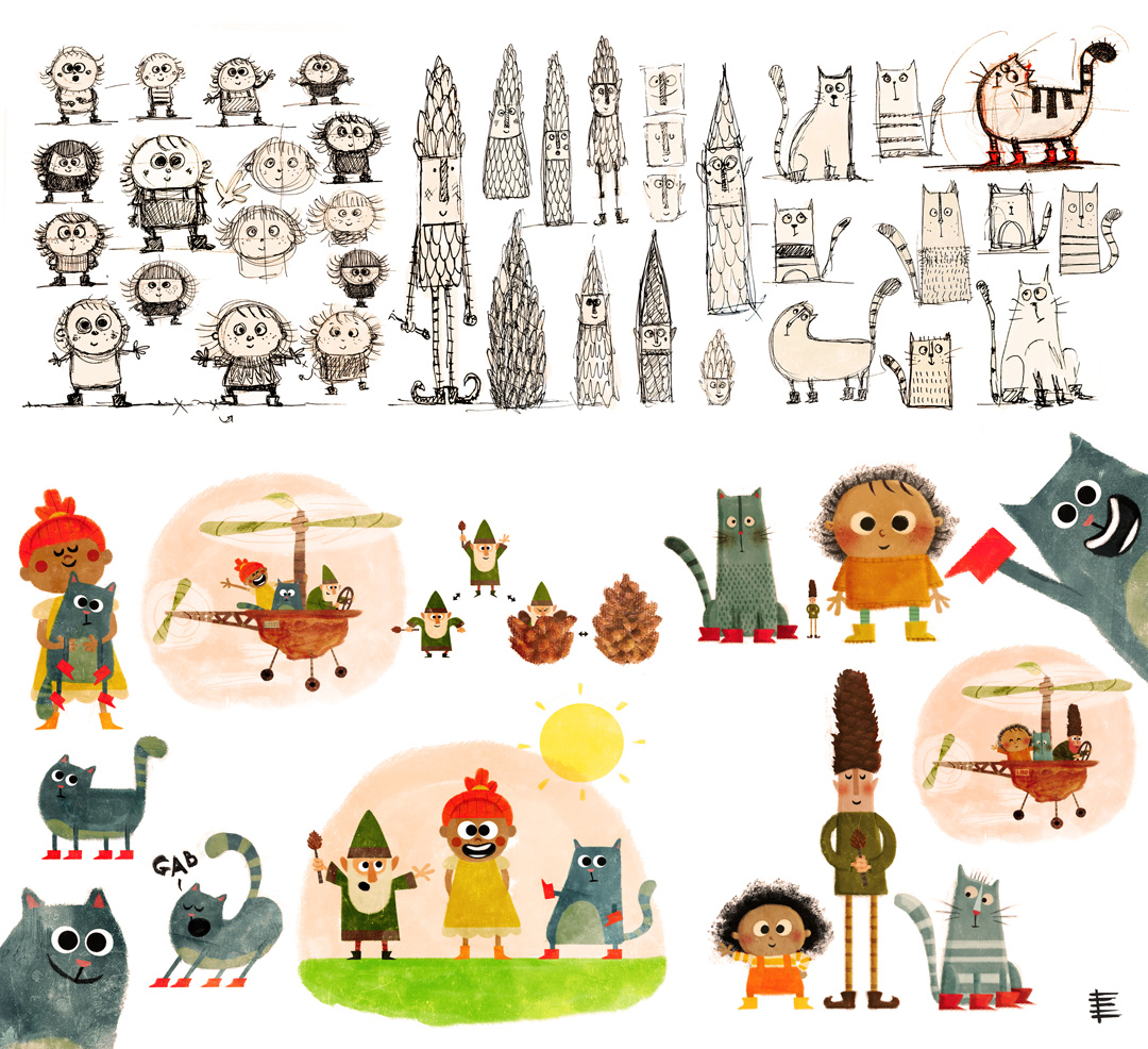
The beginning of the process of exploring the look and personality of Lille Tut, Gato and “Nisse”
When we met it just clicked. I love Maria, she’s one of my favorite people, and I’m so grateful that I got to meet her. It’s so nice to have someone to look up to, and to have this calm, collected, really cool female figure in the industry. We are almost the same age, but I still want to be like her when I grow up.
The final look of Lille Tut is really just my own style, the way I draw. Which is exactly what I wanted: I wanted to work on a project that felt like my own. Normally, when you are designing for a client, you hear so many different opinions, and people want all these different things. But Maria and I agreed that I would have a lot of creative freedom on this project: she liked my drawings and she liked my style, and supported my design choices. And of course she had her own vision, because the story is based on her own experiences and her own family, so she wanted the design to reflect that. But other than that, I was just inspired by reading the stories and doing the colors and textures I love. In that sense, she’s such a good person to work with, because she really lets you be yourself.
I have always enjoyed making colorful, cute things, although this show is probably the cutest thing I have ever designed. When I draw for myself, I like to add a little humor, or something that appeals to grownups as well, but my basic style is very colorful and cartoony. When you are designing for very young children, you need to keep it very simple and colorful. It doesn’t need to be complex and layered, and children either love it or they don’t. It’s not a very nuanced audience. Also, I had my daughter, who kind of grew up with Lille Tut. Now she’s six, so she’s growing out of it, but she’s very proud of Lille Tut, and it was nice to have her next to me, giving me insight and feedback as I worked.

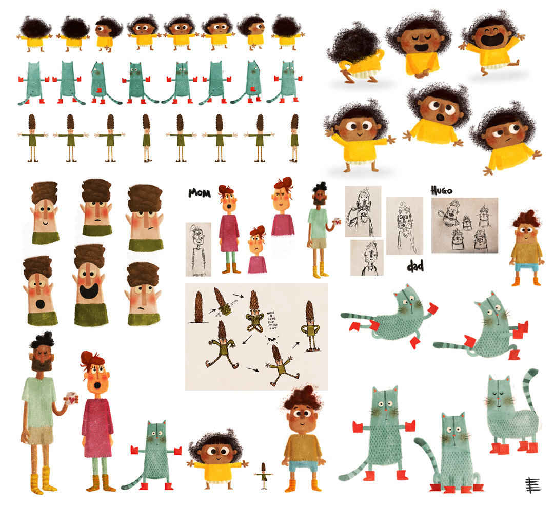
Once found, the character were further explored
Of course, being an animator informs my designs. I understand how a character needs to be constructed, and what kinds of visual elements to avoid. Sometimes as an animator you just want to kill the designer – there are too many fluffy things, for example, and sometimes it can just be a nightmare. As a designer, you can start out very loose and conceptual, but eventually you need to kind of tighten everything up. You need to know how everything looks from different angles, you need to figure out how the arms go over the head. I made the turnarounds for Lille Tut, but of course Ja Film is also so good at turning designs into animateable characters. They have so much experience and did an amazing job.
To make the books, they wanted to reuse shots from the episodes, which were already animated at that time. It was a really weird way to make books, like a collage from animation assets. We would take images from the show, and Maria would put together still images for the books, and sometimes I would go over them and make adjustments, so it was another way of collaborating.

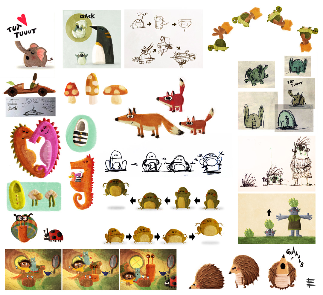
Sketches and color tests
When we did the pilot, I did all the art and design myself – I did the backgrounds and everything. Of course, when it was time to make 26 episodes, there just wasn’t time and space to do all of it, even if I wanted to. And backgrounds have never been my strong suit. I can do it, and have done them on different projects, but it isn’t my strength. When we found Sofie [Louise Dam, background and prop designer], she was just perfect. In the beginning, I thought I would have to hold her hand more and have more oversight over her work, as an art director. But she’s so good and so talented, after a couple times of commenting on the colors and answering some questions, she just ran with it. There were fewer and fewer comments and eventually she just really made it her own. I had been so scared that it would somehow morph into something I didn’t want it to be, but instead it just became so much better than if I had done it myself.
My own processes can be a bit chaotic, but over time Sofie and I made a set of guidelines about the colors and textures of the show – it was a slim bible, but we needed it. I tend to just kind of go with the flow in my own work, and that’s one of the things I loved about this project: there was space for me to be just the way that I am.
Everyone in this project is just right. This is the first project I have ever worked on where the team is so united. It’s like we were meant to be together somehow. Everything is so easy between us, with no drama. Even under the stress of production, it’s just been effortless for us to work together. Kauf [Morten Kaufmann, producer] and Maria are so good at giving everyone room to shine. I am continuing to collaborate with Maria here and there, while we wait to see if we get a second season of Lille Tut. I really hope we get another season – I loved this project, and would happily work on it forever.
Credits

Meet the Artist
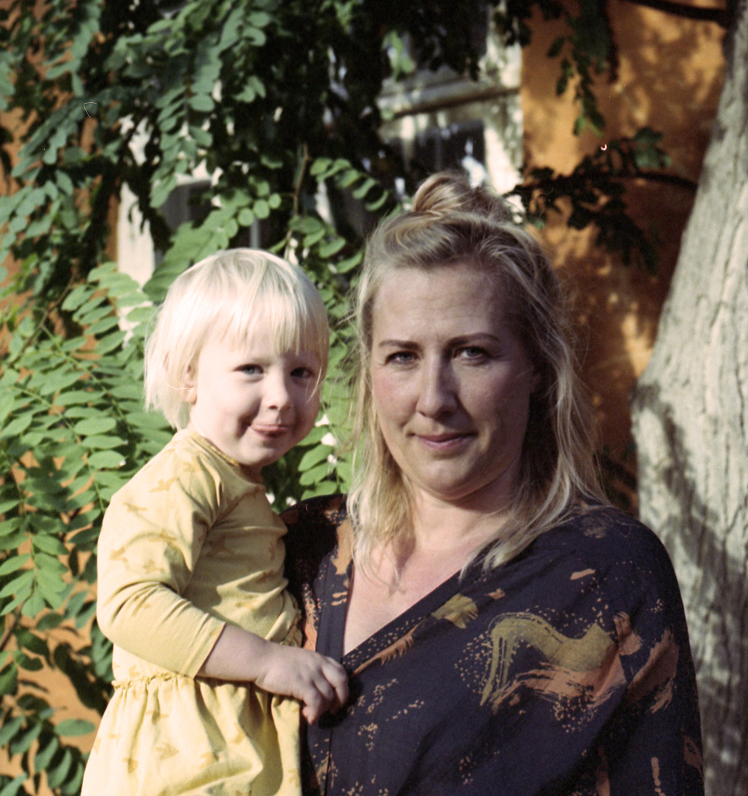
Edda Hrönn Kristinsdóttir
Where can you find Edda?
Collaborators

WeAnimate Magazine is dedicated to all the people who animate and make things, lines, and ideas come to life.
WeAnimate ApS is founded and owned by The Danish Animation Society (ANIS) www.anis.nu
Tell us what you think? Tell us at hello@weanimate.dk | #weanimate | our Privacy Policy
